the project
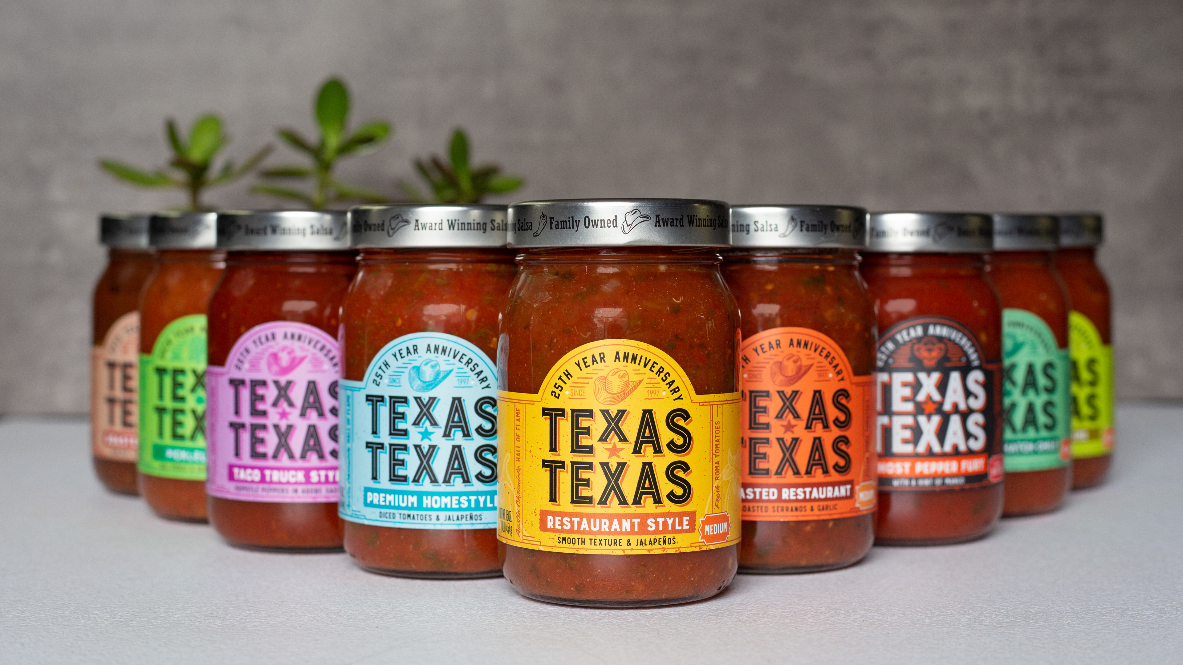
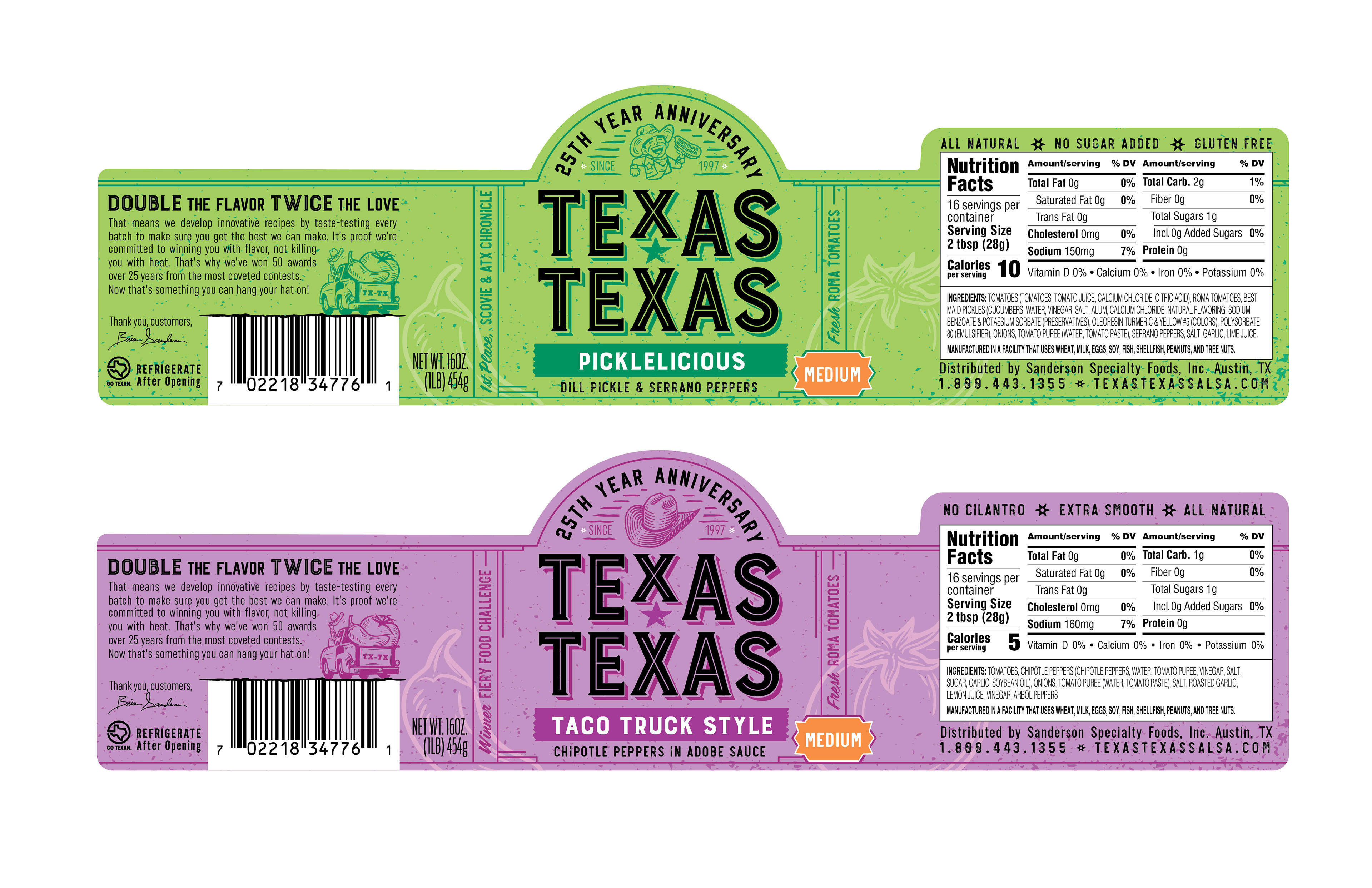
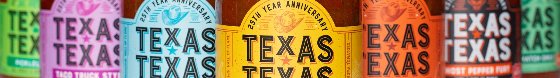
Texas Texas Salsas are a tried and true Texas favorite. Winners of dozens of awards and keepers of a down-to-earth heritage, they didn't need any help proving their product's worth. They did however want to take the next step forward in standing out on the shelf against the competition. Salsa is a saturated and creative category in stores that needs special consideration. When designing the new packaging and logo, one of the top priorities was choosing colors that stood out but still had enough of that home-town Texas feel... Rustic, but vibrant, just like their salsa. In combination with a new custom di-cut that allows the consumer to clearly see the salsa inside and some thoughtful illustration, we brought a new life to Texas Texas salsa.
client
Texas Texas Salsa, Sanderson Foods
team
Taylor Minth
Designer | Illustrator
Designer | Illustrator
Carter Skeen
Copywriter
Copywriter
Beth Tilotson
Account Service